
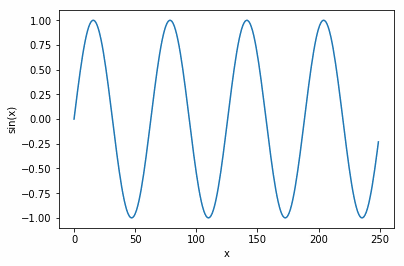
Start by plotting one chart onto the chart surface.
- Use plt.axes(), with no arguments. Matplotlib will then autofit the chart to our data.
- The function np.arange(0,25,0.1) creates 250 numbers ranging from 0 to 25 in increments of 0.1.
- The y axis will range between 1 and -1 since the sin function np.sin(x) ranges between 1 and -1.
- Annotate the chart by labelling each axis with plt.ylabel(‘sin(x)’) and plt.xlabel(‘x’).
import numpy as np
import matplotlib.pyplot as plt
x = np.arange(0, 25,0.1)
axis1 = plt.axes()
plt.ylabel('sin(x)')
plt.xlabel('x')
axis1.plot(np.sin(x))
That results in this chart:
(This article is part of our Data Visualization Guide. Use the right-hand menu to navigate.)
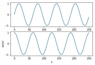
Vertically stacked figures
Now, plot two charts, one stacked on top of the other. Use plt.subplots(2). Note that we plot sin(x) in the top chart and cos(x) in the bottom to avoid graphing the same data twice.
import numpy as np
import matplotlib.pyplot as plt
x = np.arange(0, 25,0.1)
fig, axis = plt.subplots(2)
plt.ylabel('sin(x)')
plt.xlabel('x')
axis[0].plot(np.sin(x))
axis[1].plot(np.cos(x))
That results in:
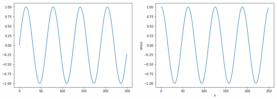
Horizontal Side by Side Figures
Here we add:
- fig, axis = plt.subplots(1,2,figsize=(15,5)) meaning 1 row and 2 columns. Add figsize meaning width and heights, respectfully.
- Note: There is something not clear here. The Matplotlib documentation says this is given in inches, but it’s not, as the chart below will show the same size regardless of the size of your monitor—and why would a system used by people around the world not use the metric system? This seems to be a relative size. So, we may have to call this a documentation bug for now. (Write to us at blogs@bmc.com if you know the answer to this.)
import numpy as np
import matplotlib.pyplot as plt
x = np.arange(0, 25,0.1)
fig, axis = plt.subplots(1,2,figsize=(15,5))
plt.ylabel('sin(x)')
plt.xlabel('x')
axis[0].plot(np.sin(x))
axis[1].plot(np.cos(x))
This results in the two charts placed side-by-side but spread farther apart.
These postings are my own and do not necessarily represent BMC's position, strategies, or opinion.
See an error or have a suggestion? Please let us know by emailing blogs@bmc.com.