
In this article, we’ll explain how to get started with Matplotlib scatter and line plots.
(This article is part of our Data Visualization Guide. Use the right-hand menu to navigate.)
Install Zeppelin
First, download and install Zeppelin, a graphical Python interpreter which we’ve previously discussed. After all, you can’t graph from the Python shell, as that is not a graphical environment.
Start Zeppelin. If you are using a virtual Python environment you will need to source that environment (e.g., source py34/bin/activate) just like you’re running Python as a regular user. This way, NumPy and Matplotlib will be imported, which you need to install using pip.
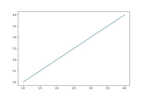
First plot
Here is the simplest plot: x against y. The two arrays must be the same size since the numbers plotted picked off the array in pairs: (1,2), (2,2), (3,3), (4,4).
We use plot(), we could also have used scatter(). They are almost the same. This is because plot() can either draw a line or make a scatter plot. The differences are explained below.
import numpy as np
import matplotlib.pyplot as plt
x = [1,2,3,4]
y = [1,2,3,4]
plt.plot(x,y)
plt.show()
Results in:
You can feed any number of arguments into the plot() function. The format is plt.plot(x,y,colorOptions, *args, **kargs). *args and **kargs lets you pass values to other objects, which we illustrate below.
If you only give plot() one value, it assumes that is the y coordinate. If you put dashes (“–“) after the color name, then it draws a line between each point, i.e., makes a line chart, rather than plotting points, i.e., a scatter plot. Leave off the dashes and the color becomes the point market, which can be a triangle (“v”), circle (“o”), etc.
Here we use np.array() to create a NumPy array. Even without doing so, Matplotlib converts arrays to NumPy arrays internally. NumPy is your best option for data science work because of its rich set of features.
Use NumPy Arrays
Here we pass it two sets of x,y pairs, each with their own color.
import numpy as np
import matplotlib.pyplot as plt
x = np.array([1,2,3,4])
plt.plot(x,x**2,'g--', x, x**3, 'o--')
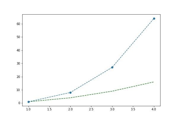
We could have plotted the same two line plots above by calling the plot() function twice, illustrating that we can paint any number of charts onto the canvas.
import numpy as np
import matplotlib.pyplot as plt
x = np.array([1,2,3,4])
plt.plot(x,x**2,'g--')
plt.plot(x, x**3, 'o--')
You can plot data from an array, such as Pandas, by element name named as shown below. Below we are saying plot data[‘a’] versus data[‘b’].
data = {'a': np.arange(10),
'b': np.arange(10)}
plt.scatter('a', 'b', c='g', data=data)
print(data)
plt.show()
This is the same as below, albeit we use Pandas.
import pandas as pd
data = {'a': np.arange(10),
'b': np.arange(10)}
df=pd.DataFrame(data=data)
plt.scatter('a', 'b', c='g', data=df)
plt.show()
In this example, the values are a dictionary object with a and b the values shown below.
'b': array([0, 1, 2, 3, 4, 5, 6, 7, 8, 9]), 'a': array([0, 1, 2, 3, 4, 5, 6, 7, 8, 9])}
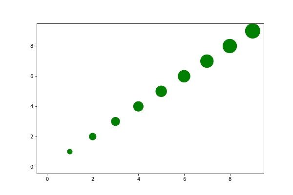
We can pass the size of each point in as an array, too:
import pandas as pd
data = {'a': np.arange(10),
'b': np.arange(10),
'c':  np.arange(10) * 100
}
df=pd.DataFrame(data=data)
plt.scatter('a', 'b', c='g', s='c', data=df)
plt.show()
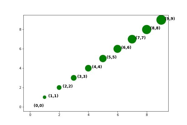
You could add the coordinate to this chart by using text annotations.
The arguments are matplotlib.pyplot.annotate(s, xy, *args, **kwargs)[.
Where:
- s is the string to print
- xy is the coordinates given in (x,y) format. Add 0.25 to x so that the text is offset from the actual point slightly.
- **kwargs means we can pass it additional arguments to the Text object. And that has the properties of fontsize and fontweight.
import pandas as pd
data = {'a': np.arange(10),
'b': np.arange(10),
'c':  np.arange(10) * 100
}
df=pd.DataFrame(data=data)
plt.scatter('a', 'b', c='g', s='c', data=df)
for row in df.itertuples():
x = row.a
y = row.b
str = "({0},{1})".format(x,y)
plt.annotate(str, (x + 0.25 ,y), fontsize='large', fontweight='bold')
plt.show()
Results in:
These postings are my own and do not necessarily represent BMC's position, strategies, or opinion.
See an error or have a suggestion? Please let us know by emailing blogs@bmc.com.