
If you are working with big data then you need to learn how to create charts, which are also known as graphs. Charting is a topic that can be extremely complicated, so we’ll start here with simple examples.
(This article is part of our Data Visualization Guide. Use the right-hand menu to navigate.)
Charts Require a Graphical Environment
You cannot draw charts from a Python program running in a character-based environment like a bash shell. Instead, you need a graphical environment.
Most data scientists use Matplotlib in a browser, since a browser can display graphics. The best way is using Zeppelin or Jupyter, as both are code interpreters and tools that can display graphics.
Matplotlin was original written as the graphic front end for a tool called matlab. Matlab is mainly used by engineers and data scientists, but it works well with Python too.
Using Zeppelin
We’ve discussed Zeppelin here before. Zeppelin lets you run programs in a variety of programming languages in a web page. It supports Spark, Python, Angular, MarkDown, Livy, a Bash shell and others. (Because it supports bash shells you would not want to put it on a public-facing web page without adding a password to it.) Zeppelin also has some built-in graphical ability, but in order to create more advanced charts, you’ll need an advanced charting product, like Matplotlib.
Here we show how to use Matplot to draw line and scatter charts and histograms. First, you need to Install Zeppelin, which is as easy as downloading and unzipping it. On Mac, start the daemon with zeppelin-daemon.sh start.
Line Charts
A line chart plots one axis against another, such as the family xy axis used in high school algebra.
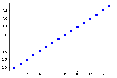
Zeppelin works with arrays. In the example below, we use the Numpy function np.arange(1,5,0.25) to create an array of evenly spaced intervals of 0.25. Then it’s as simple as calling plot: plt.plot(y, ‘bs’), where bs means blue squares. If you give it only one array, then it assumes that those are values for the y axis, so it automatically calculates the x axis.
%python
import matplotlib.pyplot as plt
import numpy as np
y = np.arange(1,5,0.25)
plt.plot(y, 'bs')
Here is the resulting chart.
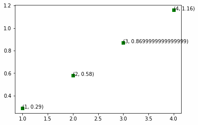
Now let’s add annotations to the line. Remember that Matplotlib calculates the x values automatically based upon the y values. The slope (m) of the line above, y = mx +1 is approximately 0.29, just by visually looking at the line and estimating. So let’s plot those (x,y) coordinates and label each point.
Let’s make the increment 1 and not 0.25 in order to avoid crowding the chart.
In the code below, the python zip(A.B) function returns tuples ((x[0],y[0]) …. ) from the arrays A and B. We do this because we need each x,y coordinate in the form of the tupel (x,y). We use the array A and B to contain the x,y coordinates.
%python
import matplotlib.pyplot as plt
import numpy as np
y = np.arange(0,5,1)
A = []
B = []
for x in range(1, len(y)):
y= (0.29*x)
A.append(x)
B.append(y)
for xy in zip(A,B):
plt.plot( xy[0],xy[1],'gs')
plt.annotate('(%s, %s)' % xy, xy=xy, textcoords='data')
Here is the same line, with each (x,y) coordinate printed as an annotation on the line.
Scatter Charts
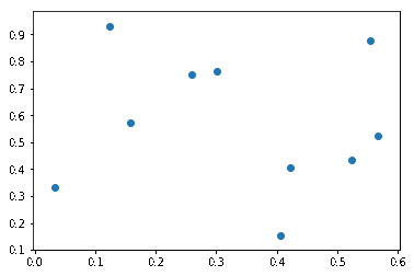
Scatter charts plot points and not lines.
%python
import matplotlib.pyplot as plt
import numpy as np
n = 10
x = np.random.rand(n)
y = np.random.rand(n)
plt.scatter(x,y)
Because we used random integers, the points are all over the place. We used the rand() function and not randint, so it generated random floating point numbers <= 1.
Histogram
In a histogram the vertical bar is the percentage of all points for each value, aka a frequency distribution. So here 17.5% of the random numbers were 3. The number 100 is called the size of the array. Here we have a 1×100 array, equivalently called a vector.
If we had used, for example, x = np.random.randint(low = 0, high = 15, size=[4,4]) it would create a 4×4 matrix of random numbers.
%python
import matplotlib.pyplot as plt
import numpy as np
x = np.random.randint(low = 0, high = 15, size=100)
plt.figure()
plt.hist(x)
plt.show()
This shows the frequency distribution. In other words, we told it to create 100 random integers between 0 and 15.

We previously explained how to create a Stacked Bar Chart.
Pie Chart
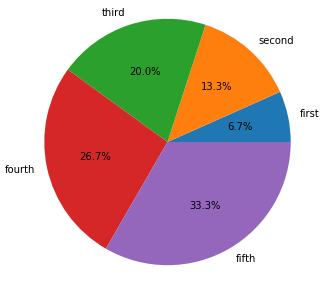
Below we create a pie chart. The sum of the percentages of each slice sums to 100%, just like a histogram. So each slice xi (called a wedge my matplot lib) is xi / sum (x1 … xn) percentage of the whole pie.
Below we give it the labels. Those have to be in the same order as the data as Matplotlib cannot automatically figure that out. In other words get them out of order and your labels will not be logical.
We also provide autopct, to plot the percentage in each wedges. We could also have put a custom function there instead.
%python
import matplotlib.pyplot as plt
import numpy as np
x = [100, 200, 300, 400, 500]
labels = ['first', 'second', 'third', 'fourth', 'fifth']
plt.pie(x,labels=labels,autopct='%1.1f%%')
plt.show()
These postings are my own and do not necessarily represent BMC's position, strategies, or opinion.
See an error or have a suggestion? Please let us know by emailing blogs@bmc.com.