
In this article, we’ll show how to use Keras to create a neural network, an expansion of this original blog post. The goal is to predict how likely someone is to buy a particular product based on their income, whether they own a house, whether they have a college education, etc.
The source code for this Zeppelin notebook is here.
(This tutorial is part of our Guide to Machine Learning with TensorFlow & Keras. Use the right-hand menu to navigate.)
First, download the data from the internet. The feature data is already categorical (0 and 1) so there is no need to do any conversion on that.
The label column is data[‘Buy’]. data.iloc[:,2:16] means takes columns 2 through 16 and all rows, where iloc is the index search operator. The colon (:) means all.
import tensorflow as tf
from keras.models import Sequential
import pandas as pd
from keras.layers import Dense
url = 'https://raw.githubusercontent.com/werowe/logisticRegressionBestModel/master/KidCreative.csv'
data = pd.read_csv(url, delimiter=',')
labels=data['Buy']
features = data.iloc[:,2:16]
Now, we split the data into a 33% and 66% training and testing data sets, which is the normal convention for machine learning: take the input data, split it, and use one set to train the model. Then you use the other set to check its accuracy.
np.ravel(labels) create an array from the Pandas series labels.
import numpy as np
from sklearn.model_selection import train_test_split
X=features
y=np.ravel(labels)
X_train, X_test, y_train, y_test = train_test_split(X, y, test_size=0.33, random_state=42)
Here we normalize the data, which means putting it on some common scale (value – mean / standard deviation), a machine learning data convention.
from sklearn.preprocessing import StandardScaler
scaler = StandardScaler().fit(X_train)
X_train = scaler.transform(X_train)
X_test = scaler.transform(X_test)
Now we create a neural network with three layers. The input shape is (14,1) since there are 14 feature columns in the data Pandas dataframe.
We use binary_crossentropy for the loss function and Stochastic Gradient Descent for the optimizer as well as different activation functions. The choice of which to choose is arbitrary. Pick one, try another, pick another, and see which created the most accurate model.
The number of layers and the number of epochs are completely arbitrary. You can increase those to perhaps increase the accuracy of the model, but any variation is going to be only slight as this model converges in just a couple of steps.
model = Sequential()
model.add(Dense(8, activation='relu', input_shape=(14,)))
model.add(Dense(8, activation='relu'))
model.add(Dense(1, activation='sigmoid'))
model.compile(loss='binary_crossentropy',
optimizer='sgd',
metrics=['accuracy'])
model.fit(X_train, y_train,epochs=8, batch_size=1, verbose=1)
Epoch 1/8
450/450 [==============================] - 2s 5ms/step - loss: 0.4760 - acc: 0.7844
Epoch 2/8
450/450 [==============================] - 1s 1ms/step - loss: 0.3338 - acc: 0.8511
Epoch 3/8
450/450 [==============================] - 1s 1ms/step - loss: 0.2521 - acc: 0.9000
Epoch 4/8
450/450 [==============================] - 1s 1ms/step - loss: 0.2058 - acc: 0.9156
Epoch 5/8
450/450 [==============================] - 1s 2ms/step - loss: 0.1829 - acc: 0.9311
Epoch 6/8
450/450 [==============================] - 1s 1ms/step - loss: 0.1740 - acc: 0.9311
Epoch 7/8
450/450 [==============================] - 1s 2ms/step - loss: 0.1630 - acc: 0.9311
Epoch 8/8
450/450 [==============================] - 1s 1ms/step - loss: 0.1583 - acc: 0.9378
Here we use the evaluate() method to show the accuracy of the model, meaning the ratio (number of correct predictions)/(number of predictions),
You can print y_pred and y_test side-by-side and see that most of the predictions are the same as the test values. That’s to be expected as the accuracy of this model is 93.78%.
y_pred = model.predict(X_test)
score = model.evaluate(X_test, y_test,verbose=1)
print(score)
223/223 [==============================] - 1s 3ms/step
[0.18696444257759728, 0.9372197314762748]
Correlating the data
A necessary step in machine learning is to plot is to see if that supports your hypothesis that the data is correlated. et’s separate the data into buyers and non-buyers and plot the features in a histogram. We stack one histogram on top of the other so that they all fit.
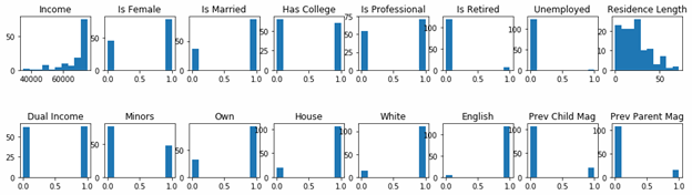
Buyers
We obviously believe that people with certain income, education level, current/prior homeownership, etc., will predict whether they will buy or not.
df is a new dataframe with all the columns of the original data frame data.columns. We create that and then select people who have bought using the df.loc[(df.Buy == 1)] operator. df.loc selects columns based on a row value.
fig, ax = plt.subplots(2,8,figsize=(16, 4) ) means to create a figure of two rows with 8 charts. So each chart is then referenced by ax[row,column].
fig.subplots_adjust(hspace=1, wspace=0.2) gives us horizontal spacing between and width.
buyers.columns[2:] means to take the 3rd column to the last one in the dataframe. We don’t have to plot a history of the observation number, buy-or-not, and income columns as those would not lend themselves to being plot as a histogram.
df = pd.DataFrame(data, columns= np.array(data.columns))
buyers = df.loc[(df.Buy == 1)]
import matplotlib.pyplot as plt
fig, ax = plt.subplots(2,8,figsize=(16, 4) )
i = 0
j = 0
for c in buyers.columns[2:]:
ax[j,i].hist(buyers[c])
ax[j,i].set_title(c)
i = i + 1
if i == 8:
j = 1
i = 0
fig.subplots_adjust(hspace=1, wspace=0.2)
plt.show()
As you can see, people with higher incomes, are professionals, have jobs, have dual incomes, and who own their house are most likely to have bought.
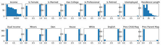
Non-buyers
Now we do the opposite and pick out people who did not buy anything.
df = pd.DataFrame(data, columns = data.columns )
notbuyers = df.loc[(df.Buy == 0)]
import matplotlib.pyplot as plt
fig, ax = plt.subplots(2,8,figsize=(16, 4) )
i = 0
j = 0
for c in np.array(data.columns)[2:]:
ax[j,i].hist(notbuyers[c])
ax[j,i].set_title(c)
i = i + 1
if i == 8:
j = 1
i = 0
fig.subplots_adjust(hspace=1, wspace=0.2)
plt.show()
Comparing histograms
In easily see the differences between the buy versus non-buy persons, we shown both charts below together.
Buyers histogram

Non-buyers histogram
These postings are my own and do not necessarily represent BMC's position, strategies, or opinion.
See an error or have a suggestion? Please let us know by emailing blogs@bmc.com.