
Part of our ongoing Tableau series, this article explains how to create a text table.
You can think of a text table in Tableau as the same as a pivot table in Excel. It’s a table, not a chart, with one or more values in the rows and one or more values in the columns. The easiest way to picture a text table is to think of sales or expenses by date. In this example, we will use expenses.
(This article is part of our Tableau Online Guide. Use the right-hand menu to navigate.)
Putting data in Tableau
If you’re new to Tableau, see our starter article Tableau: Getting Started with Real Examples. For the data, I’m using my credit card statements. You can easily download your credit card into one of the supported data sources, like PostgreSQL.
Defining measures and dimensions
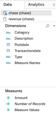
First, we need to understand two concepts: measures and dimensions. There are long definitions in various tutorials that try to explain what dimensions and measures are. But here’s a really easy one:
- A measure is a number, which is anything you can do math on. A measure includes expenses, sales, etc.
- A dimension is anything that is not a number, such as dates, or text fields like category.
In Tableau, fields are grouped by dimension and measures on the left-hand side of the worksheet editor, like this:
Examples of text tables
By default, Tableau is designed to work with sums, which they call aggregation. So, a text table will by default display aggregated data.
Here are some examples of what your text table can show:
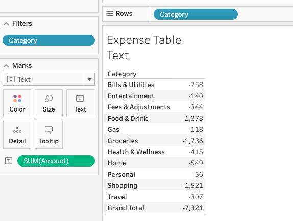
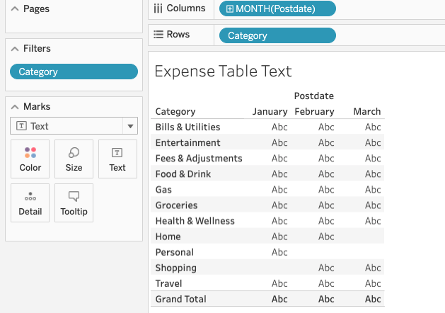
Expenses by category
This table has one dimension, category, and one measure, expenses.
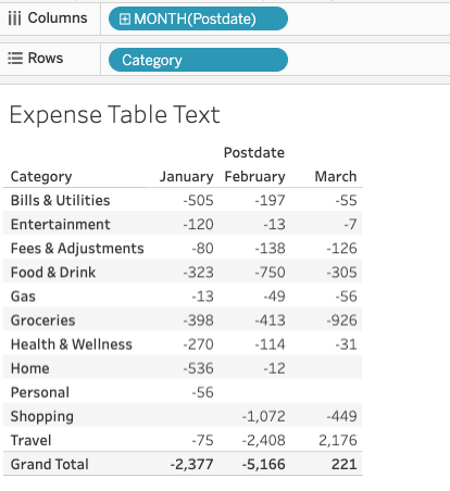
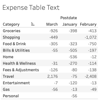
Expenses by date and category
In this table, we add a second dimension: date. If this was a chart you would say that a dimension is an axis, like the XY-axis in a scatter chart.
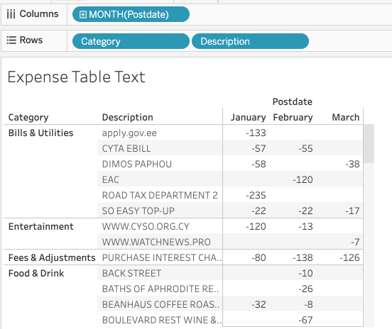
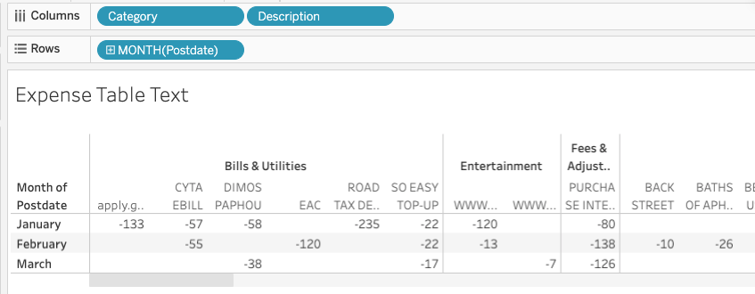
Expenses by date, category, and description
Here, we’ll add a third dimension: payee. You could use any other description, too.
(Note: If this was a chart it would be a three-dimensional chart. Because those are hard to visualize, it’s easier to use a text table. Of course, there are ways to see more than one dimension on a chart by, for example, adding more than one line to a line chart and making use of both the left and right-hand axes of a chart.)
We put dimensions on the row and columns. If you were to flip the rows and columns of the text table above, you get two columns of columns (category and description) by month.
This makes sense if you think of the idea of a column as being all the fields you have added to the column line at the top. A programmer would call this (category, description) a tuple.
You can also think of rows the same way, as being a collection of whatever you assign to the row line. For example, above each row contains both category and description or (category, description) pairs.
Adding measures to the text table
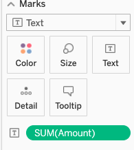
When you first pick a row and column dimension, Tableau does not know what value you want to put at each row, column intersection. So, it populates each cell with abc. To fix that, we add a measure to the table. You do that by dropping it onto the marks tab and then selecting text, line, bar, or however you want to display this. We use text for a text table.
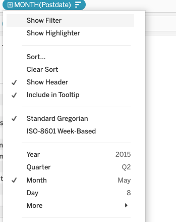
First note that we change date from year(Postdate) to Month(Postdate) as Tableau, by default, usually assumes we want to sum values by year. That is, aggregation is its initial position, and for whatever reason it picks year first.
To put a number (dimension) onto the table, drag a dimension, in this case amount, onto the text mark. Since Tableau assumes aggregation it will add sum() to amount to give us expenses by month.
Then the worksheet fills in the numbers:
These postings are my own and do not necessarily represent BMC's position, strategies, or opinion.
See an error or have a suggestion? Please let us know by emailing blogs@bmc.com.