
Here we show how to plot more than one metric on a single vertical axis in Tableau Online. Metrics are called Pills in Tableau, since they are shaped like a pill.
(This article is part of our Tableau Online Guide. Use the right-hand menu to navigate.)
The problem
For the beginner, Tableau Online is frustrating because, when you put two metrics on the rows (horizontal), it draws two charts as the default behavior. Users of Microsoft Excel are used to Excel doing the desired behavior, plotting multiple axes, automatically.
In Part 1 of this tutorial, we did that using a union. Here we do that by taking two data points from a single view. We’ll create charts with:
- Two data points on the left vertical axis
- Two data points with one on the left axis and one on the right
Generate your data
You can run this Python code to create some data and then run this SQL command to add a revenue column. Or just pick any data that you have and follow these general instructions.
create view revenue as select salesdate, product, quantity, quantity * random() * 10 as revenue from sales;
Plot two data points on left vertical axis
Create a new data source.
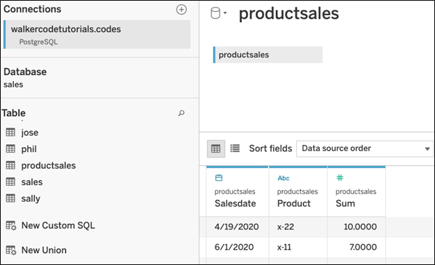
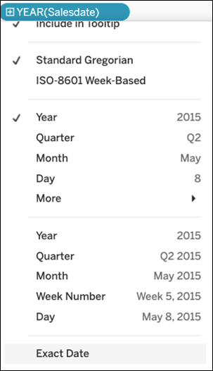
Drag the Salesdate to Columns and then change the date from YEAR() to exact date.
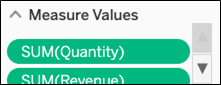
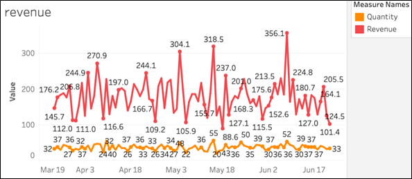
This next step is not exactly intuitive. Drag Measure Names onto the Color Mark. Drag the Measure Values to Rows. This creates a legend to the right for each metric and plot each metric on the chart. (That is the frustrating part for beginners as if you drag each metrics onto Rows it makes a separate chart for each metrics.)
You’ll also want to remove SUM(Number of Records) as that’s not too useful, but Tableau Online adds it to the chart automatically. So, scroll down and find it and remove it from here:
The chart now looks like this:
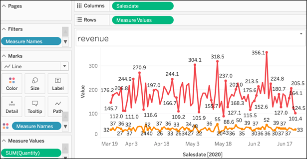
Zoom in for a closer view:
Plot two data points on dual axis
The chart above looks OK. You could change the label Value to Revenue/Quantity. But let’s use another technique and plot one metric on the left axis and the other on the right axis.
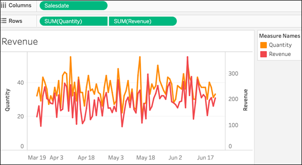
So, instead of using Measure Values drag Revenue and Quantity onto Rows.
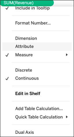
Tableau makes two charts. So click Sum(Revenue) and then select Dual Axis to make one instead.
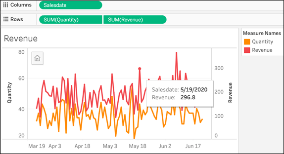
The resulting chart is a bit crowded:
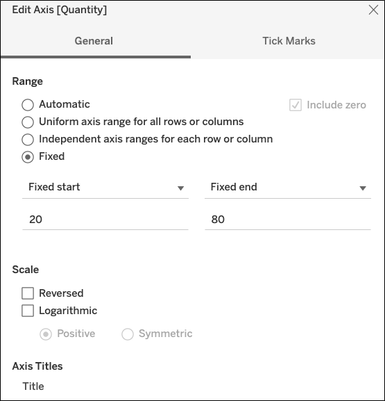
So, edit the quantity axis to force values to a range that does not overlap with the revenue range.
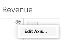
Set a fixed range.
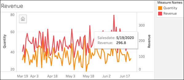
Now it’s easier to read:
Zoom in for a closer view.
These postings are my own and do not necessarily represent BMC's position, strategies, or opinion.
See an error or have a suggestion? Please let us know by emailing [email protected].