
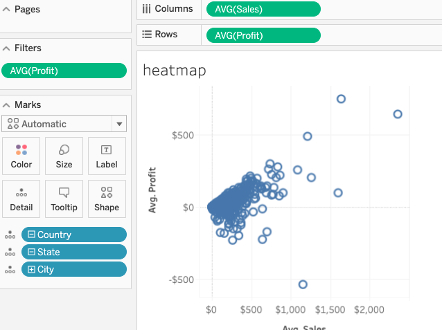
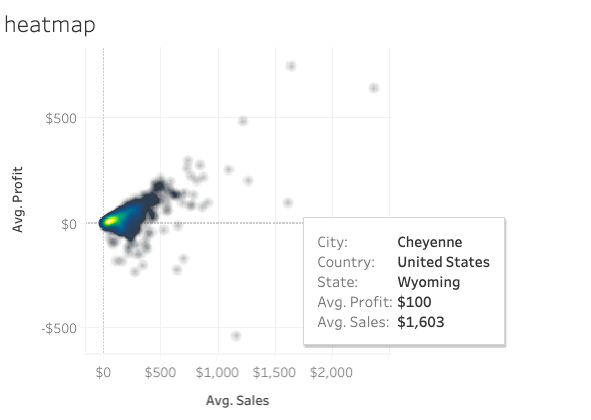
In the chart below, the data points are too close together—a common problem that prevents you from reading the chart and gaining any intelligent meaning.
A heat map solves this problem by adding color to illustrate where individual points overlap. The color changes or intensifies as the number of data points in a region increases. The heat map also lets us put an additional metric on the otherwise 2-dimensional chart.
So, let’s look at how you can create a heat map in your Tableau Online chart.
(This article is part of our Tableau Online Guide. Use the right-hand menu to navigate.)
Creating a heat map
To make a simple heat map, open Tableau Online and create a new worksheet. Choose the Superstore Datasource, which is included with Tableau.
Now go to the worksheet editor:
We want to figure out which sales offices are producing the highest sales and profits. We need to look at both sales and profits together. This is because, for examples, sales can be high while profits low, which may indicate that the sales office is giving too many discounts or operating at too high a cost.
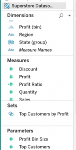
So, we plot three metrics:
- Average sales
- Average profit
- Office location (city)
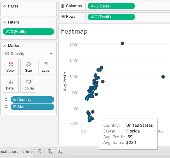
Drag sales to columns and profit to rows. Change SUM() to AVE(Sales) and AVE(profit). Then drag city onto the detail mark. Then change the chart type to density.
We then get this heat map:
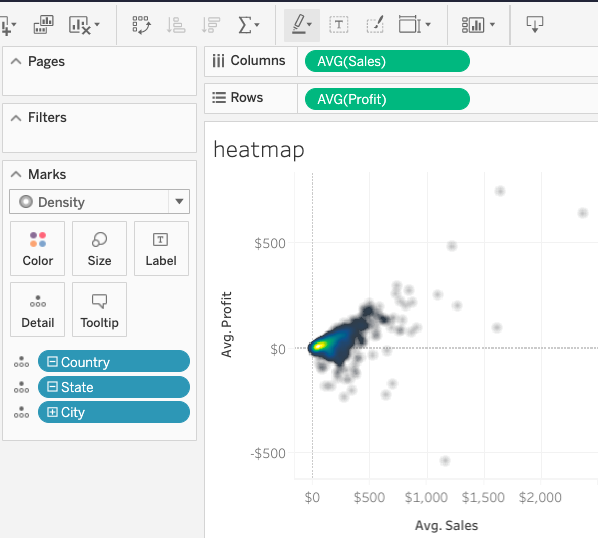
Of course, the data is still too close together to read all the data points. But that is not the point in this exercise: if we wanted to read individual metrics, we could have made a cross table with just text. Instead we use the heat map to identify both outliers as well as the profitability at which most offices are operating.
To drill in to read single office details, click on the chart to get the data point located there.
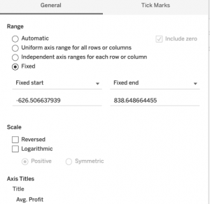
To zoom into an area, thus removing the outliers, we can adjust the axes by setting the axis range to fixed and entering a value there.
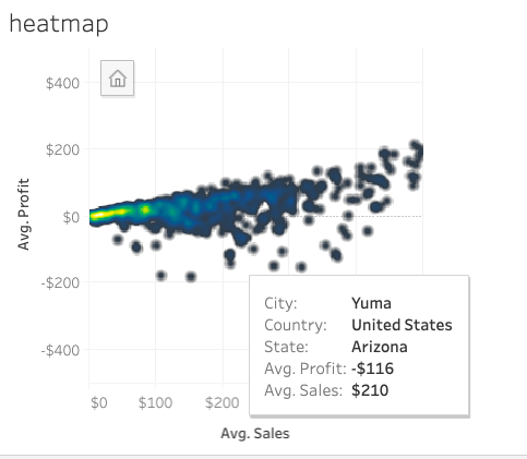
That results in a chart zoomed into a closer level like this. Now we can click on the data points in that zoomed-in region to more closely inspect that tightly packed region.
We could also drop the cities, only look at the states, but then there is less need for a heat map—that chart would not be as dense.
These postings are my own and do not necessarily represent BMC's position, strategies, or opinion.
See an error or have a suggestion? Please let us know by emailing [email protected].