
A box and whisker plot provide more statistical information on a single chart than you would normally be able to fit. It lets you see at a glance the median and the range of data points that lie within each quartile.
(This article is part of our Tableau Online Guide. Use the right-hand menu to navigate.)
Median definition
The median is not the average. Median is defined as the point that divides the number of data points in half. That means the value where 50% of the points are above that value and 50% are below. Quartiles divide that range of data into four equal ranges. Those quartiles are then 1st, 2nd, 3rd, and 4th.
Whiskers and hinges in Tableau
Tableau has their own names for these quartiles: hinges and whiskers. The whiskers are the ends of the range. The hinges are bottom and top of 2nd and 3rd quartiles respectively.
Tableau draws a box around the 2nd and 3th quartile, hence the name box and whisker chart.
Box and Whisker Chart Illustrated
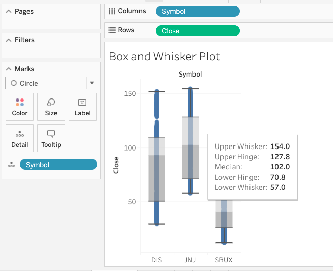
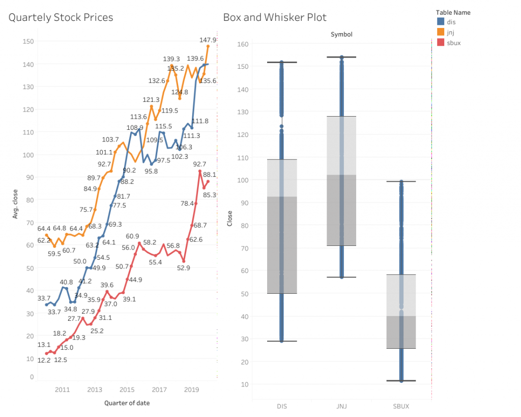
For example, if we look at the range of stock prices for three stocks over a certain period of time we get this box and whisker plot:
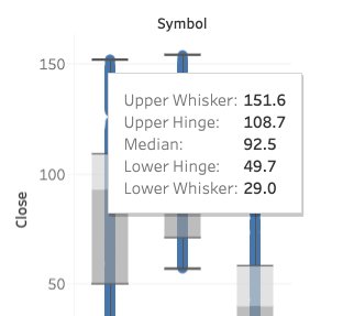
The stock on the left is Johnson & Johnson. Over this time period, the price has ranged from $29 to $151.60. The median price is $92.50 because half of the prices range between the lower and upper hinges, which are the 2nd and third quartiles. The box colored grey is the 2nd quartile. Light grey is the third.
How are box and whisker charts useful?
The box and whisker chart conveys in one glance more information than you’d otherwise get from a bar chart. That is useful when, for example, you need to print these charts, showing them to someone or using them as part of a non-digital presentation.
The usual way that online charts provide additional information is by popping up a text box with extra metrics when you hover the mouse over one spot—which you obviously cannot do on paper.
How to create a box and whisker chart
Download a source of stock prices and connect that to Tableau. You can use this data, which I assembled from Yahoo Finance and Stockpup and then loaded into a database.
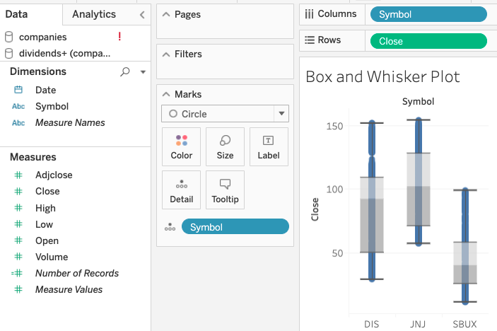
Now you put the stock symbol on the columns and the closing stock price on the row. Change the close to a dimension so that it uses individual daily stock prices and does not average or sum.
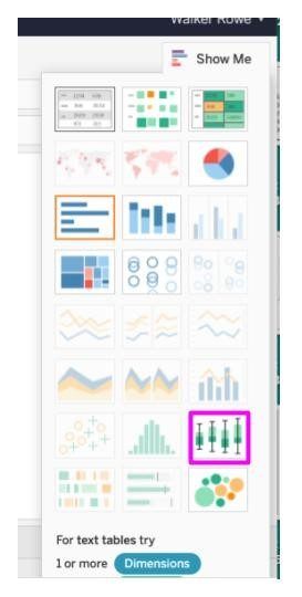
Drag the stock symbol onto the detail mark. Pick the whisker and bar chart type. If that chart is greyed out then clear the chart and draw symbol and close into place, which will put sum(close). Charts are greyed out when they don’t logically fit the data presented to them.
When you change sum(close) to close—by changing it to a dimension—the whisker and box plot options is greyed out. I am not sure why that it the case as the chart would work for both metrics, but that’s how Tableau works.
Now the worksheet should look like this:
Zooming in close we can see the popup text box that gives you the ranges. (Here you see it exactly. You can also estimate it from the vertical axis.)
Check your work
You should always check your work to alleviate any doubts you have about these numbers by plotting each of these stock prices over time. You check your work by presenting the same information in another format. Whenever you do data charting, with Tableau or any type of charting software, you should perform checking like these to find and resolve any errors.
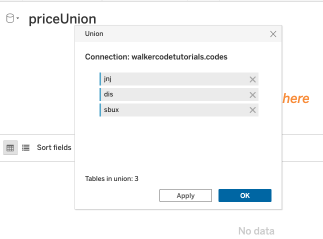
Plot multiple lines
Here, I make a union as it’s the easiest way to put multiple lines on a line chart. So first I make three views:
| create view sbux as select * from prices where symbol = ‘SBUX’; create view jnj as select * from prices where symbol = ‘JNJ’; create view dis as select * from prices where symbol = ‘DIS’; |
Then create a Union datasource in Tableau, adding each view to the union:
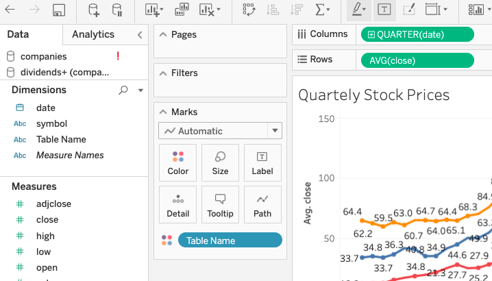
Now plot stock price by quarter against the average closing price. Don’t plot the exact date as there will be too many data points to easily read.
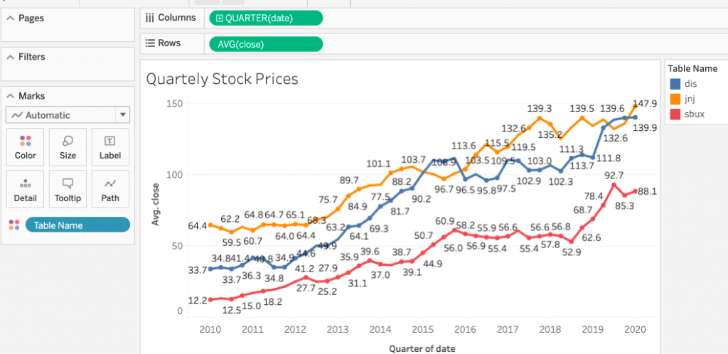
As we see, J&J has never exceeded $151, and the highest monthly price was near that amount. So, this gives us more confidence in the box and whisker chart we created above. If you want to check the daily prices, you’ll know for certain. The top prices should be $151.
Make a dashboard
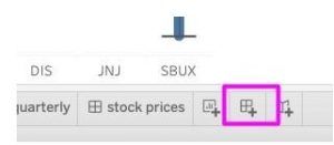
You need to make a dashboard so that users can both get a larger view of the chart plus not be able to make changes to your worksheet. So, click on the dashboard icon:
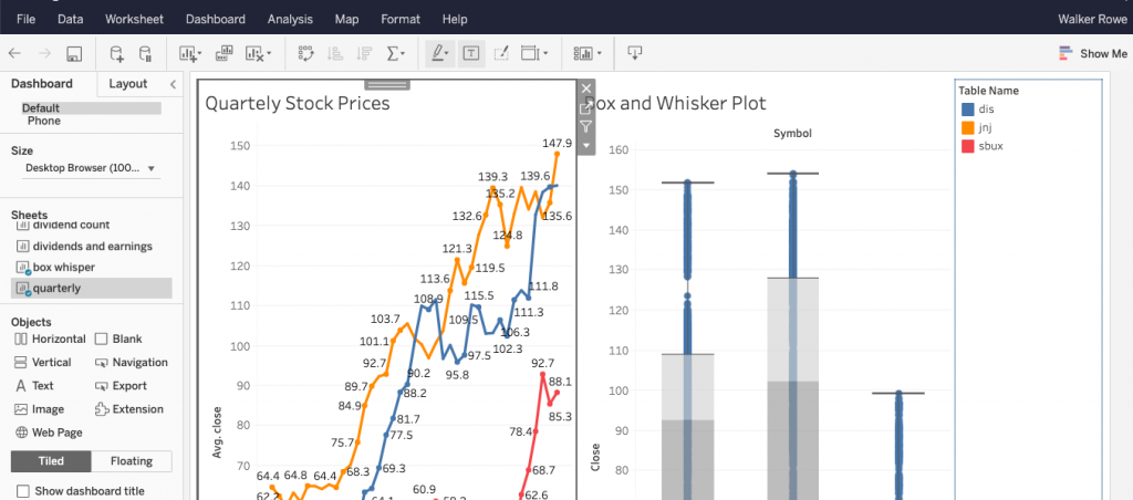
Now drag the worksheet you just made onto the dashboard:
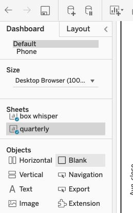
You can add both charts you just made onto the dashboard as well:
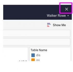
Close the worksheet
Finally, it’s sometimes difficult to figure out how to close the worksheet and get back to the user-friendly landing page from where users can see their favorites dashboards. To close your worksheet, use this X:
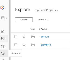
Explore your charts
From the landing page, you can use the Explore button to open a folder and flip through the charts in each, viewing whichever ones you want:
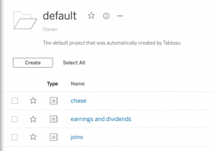
In the default folder we have these folders:
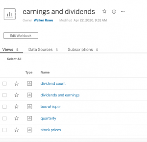
And these charts in earnings and dividends:
The star lets the user mark their favorite which will show up when they first open Tableau.
Click on the dashboard that we just made and here it is. In addition to being larger it also adds the ability to download the chart as an image file, which is useful.
These postings are my own and do not necessarily represent BMC's position, strategies, or opinion.
See an error or have a suggestion? Please let us know by emailing [email protected].