
In order to minimize the impact to end users and the business, IT operations (ITOps) teams need to know about any IT infrastructure (e.g., data center resources, networks, multicloud services, etc.) or application issues as quickly as possible. Dashboards are a quick and effective way to see live data and can help ITOps teams quickly identify an issue and take action.
While most dashboards allow you to easily plot multiple attributes for a single service, most ITOps teams manage a large number of services—each with its own set of interdependencies—making it difficult to monitor the health of all services, identify a problem, and isolate the root cause. In such cases, users have historically needed to manually switch between interrelated reports in order to analyze the impact, which is incredibly tedious and time-consuming.
What is BMC Helix Dashboards?
A software-as-a-service (SaaS) tool on the BMC Helix Portal, BMC Helix Dashboards offers unified reporting and gives you a consolidated view of data from all applications across your environment. You can easily create, export, and share interactive dashboards with both internal and external users based on user roles and permissions. The dashboards are easy to read and easy to understand, making collaboration between teams faster. An intuitive dashboard layout allows for everyone from a new site reliability engineer (SRE) all the way up to the chief technology or information officer (CTO/CIO) to share the same dashboard view.
For even greater benefits and insights you can use BMC Helix Discovery, a cloud-native discovery and dependency mapping solution, in tandem with BMC Helix Dashboards to more efficiently manage your infrastructure. This dynamic service modeling tool provides visibility into hardware, software, and service dependencies across cloud and on-premises environments, which in turn fuels BMC Helix Dashboards with a comprehensive view of all services.
BMC’s IT team, for example, manages 28 business services and 471 technical services. With BMC Helix Dashboards and BMC Helix Discovery, we can get the health status of all business and technical services in a single dashboard and identify impacted services in real time.
While there are many use cases that BMC Helix Dashboards can deliver on its own as a standalone tool, in this blog post I am going to talk about two real-life examples that demonstrate how BMC Helix Dashboards, along with BMC Helix Discovery, can make ITOps teams’ jobs much easier.
Use Case 1: See the top impacted services in a single view
The dashboard below shows the top five impacted business and technical services (due to open events) and an associated health score:
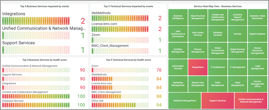
Figure 1. This dashboard shows the top five impacted business and technical services.
It has a heatmap view of services impacted in red and not impacted in green. In this example, we have included the top five services impacted, but the solution can be configured for any number of services and ordered by open events, health score, etc.
These are the resources required to create the dashboard view above:
- Data sources: Since the BMC Helix data source doesn’t contain service name details directly in the Event/Metric query types, we also need to add the BMC Helix API data source, which is used to fetch the mapping of ServiceID and Service Name from the SmartGraph REST API. So, add the two data sources below in the dashboard:
-
- BMC Helix: This will fetch event and metric data by ServiceID.
- BMC Helix API: This will fetch the mapping of Service Name and ServiceID from the SmartGraph REST API.
- Transformations: Use the following transformation options to process the data fetched from the above data sources:
-
- Outer join: Use the ServiceID column to join data from the above two data sources.
- Filter data by values: Exclude null values after join.
- Sort by: Sort by event count.
- Visualization plugins: Use the following visualization plugins to visualize the data:
-
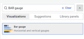
- Bar gauge: Shows the top five impacted services as a bar gauge in descending order.
- Stat: Shows individual business service status as red or green.
- Dashboard filters: N/A
Find detailed steps below to create this dashboard:
- Login to BMC Helix Dashboards (user must have Reporting Admin or Reporting Editor role)
- Navigate to Home > Dashboards > New dashboard > Add new panel to create a new dashboard.
- Select Data source as Mixed, first data source as BMC Helix, Query type as Events, and other details as shown in the snapshot below:
Query: (!status:CLOSED AND !status:BLACKOUT) AND (severity:MINOR OR severity:MAJOR severity:CRITICAL ) AND !class:ABNORMALITY OR !class: INCIDENT_INFO AND (!msg:”SGE:[PATROL]- DB Backup impacted with long running Save Session on Servers”)
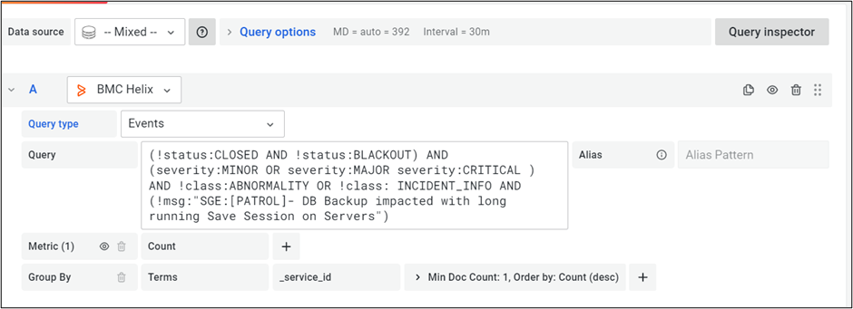
This query will pull any events that impact the health status of any service, grouping the events count by ServiceID, and can be modified based on the criteria defined for impacted events.
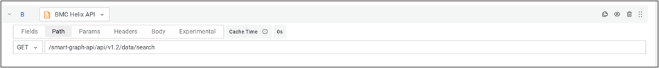
- Click on the + Query icon to add one more data source and select Data source as BMC Helix API.
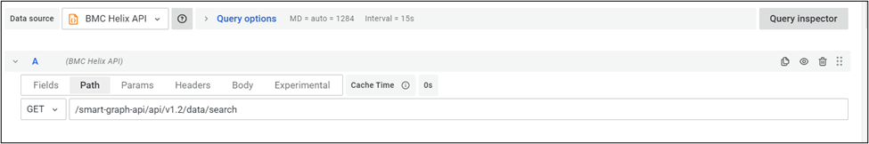
- Click on the Path tab and add the following details:
- HTTP Request type: GET
- Path URL: /smart-graph-api/api/v1.2/data/search
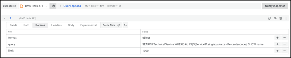
- Click on the Params tab and add the following three parameters:
- Format: object
- Query: SEARCH BusinessService SHOW name
- Limit: 1000
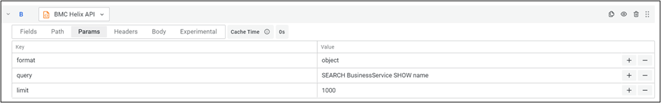
This will call the SmartGraph REST API with a query to search all business services and get each one’s Service Name and ServiceID. By default, the SmartGraph REST API returns only 100 rows, so make sure to add a limit parameter to get all rows.
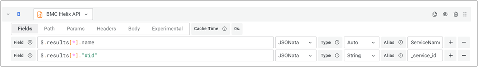
- Click on the Fields tab of the data source and add two fields to extract Service Names and ServiceIDs from the REST API response, as shown in the below snapshot:
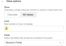
- Select Visualizations plugin as BAR gauge and make other configuration changes (e.g., Color scheme, Orientation, etc.):
| Visualization | Value options | Color scheme |
| 
|
- Add one more panel to show the Technical Services details in a similar way by repeating steps 3 to 8 with only one change in the step 6 query, as follows: SEARCH TechnicalService SHOW name.
- Add two more similar panels for Services impacted by health score by repeating steps 3 to 9 with the below change in step 3 (here we selected the Query type as Metric instead of Events and other details as shown below):
This query fetches health score metric data for all services.
Your new dashboard showing a health overview of all your services in a single-page view is now ready.
Use Case 2: Compare multiple services in a single view to identify common problem areas
Consider another use case where an IT team has already identified the top impacted business and technical services from the above dashboard view (Use Case 1). Now, they can drill down and find out if any common problem areas exist between the impacted services by comparing different service metrics (e.g., health score, open events, incidents, etc.) for a given period.
The dashboard below compares the health scores of selected services and can be extended to include other metrics:
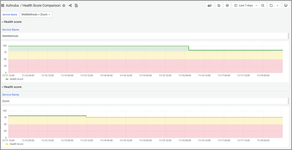
Figure 2. This dashboard compares the health scores of selected services.
Below, find the resources required to create the dashboard above:
- Data sources: Add the following data sources to fetch the dashboard data:
-
- BMC Helix: This will fetch Health Score metric data for selected Services by ServiceID.
- BMC Helix API: This will fetch the mapping of Service Name and ServiceID from the SmartGraph REST API.
- Transformations: Add the following transformation options to process the data fetched from the above data sources:
-
- Outer join: Use the ServiceID column to join data from the above two data sources.
- Filter data by values: Exclude null values after join.
- Sort by: Sort by health score.
- Visualization plugins: Use the following visualization plugins to visualize the data:
-
- Timeline: Shows health score data on a graph over a specified date and time range.
- Table: Shows the Service Name for each ServiceID.
- Row: Groups the two plugins above as a single entity and adds a repeat option, so that health score data is populated for all selected services.
- Dashboard filters: Select the following dashboard filter variables:
- Timeline: Shows health score data on a graph over a specified date and time range.
- ServiceID (hidden): This will fetch the ServiceIDs of the selected service names and pass them to BMC Helix data source queries in the dashboard panels.
Find detailed steps below to create this dashboard:
- Login to BMC Helix Dashboards (user must have Reporting Admin or Reporting Editor role).
- Navigate to Home > Dashboards > New dashboard > Add new panel to create new dashboard.
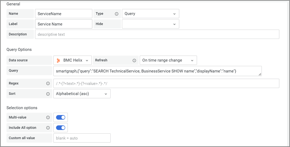
- Click on the dashboard’s Settings icon at the top right and then select the Variables tab. Add a variable with the name “ServiceName” to get a service names list from a SmartGraph query. Select the following options for the variable:
- Data source: BMC Helix
- Query: smartgraph,{“query” : “SEARCH TechnicalService, BusinessService SHOW name”, “displayName” :”name”}
- Make sure to enable “Multi-value” and the “Include All” option.
Refer to the screenshot below for more details:
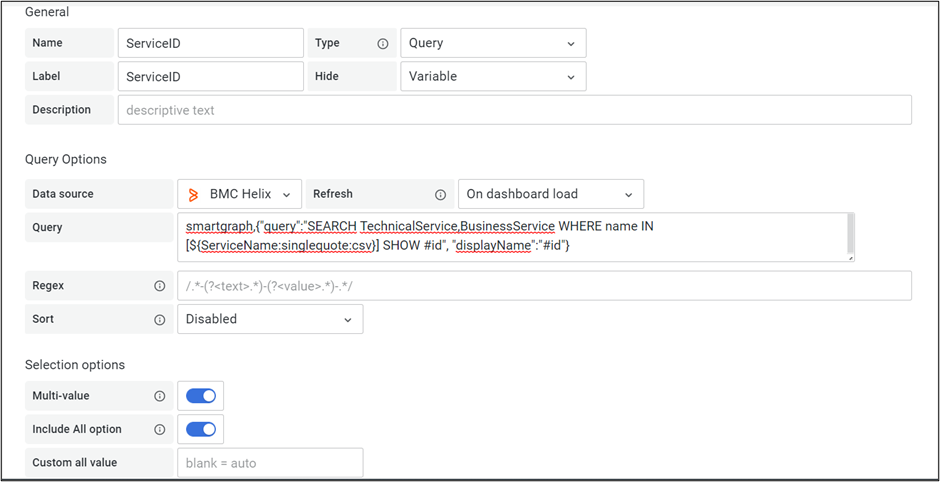
- Add one more variable with the name “ServiceID” Select the following options for the variable:
- Data source: BMC Helix
- Query: smartgraph, {“query” : “SEARCH TechnicalService, BusinessService WHERE name IN [${ServiceName:singlequote:csv}] SHOW #id”, “displayName”:”#id”}
Here, we are using the following Grafana variable formatting options:
- singlequote, which adds a single quote to each service name value.
- csv, which adds a comma after each service name.
c. Make sure to enable “Multi-value” and the “Include All” option.
Refer to the screenshot below for more details:
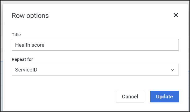
- Add a new row panel; in Settings, select Repeat for as “ServiceID” and click on Update:
- Add a new panel inside the above row panel with details as below:
- Visualization plugin: Table
- Data source: BMC Helix API
- Click on the Path tab of the BMC Helix API data source and add the following details:
- HTTP Request type: GET
- Path URL: /smart-graph-api/api/v1.2/data/search
- Click on the Params tab and add the following three parameters:
- Format: object
- Query: SEARCH TechnicalService WHERE #id IN [${ServiceID:singlequote:csv:Percentencode}] SHOW name
- Limit: 1000
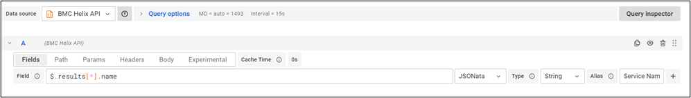
- Click on the Fields tab and add the following details:
- Field: $.results[*].name
- JSON function: JSONata
- Type: String
- Alias: Service Name
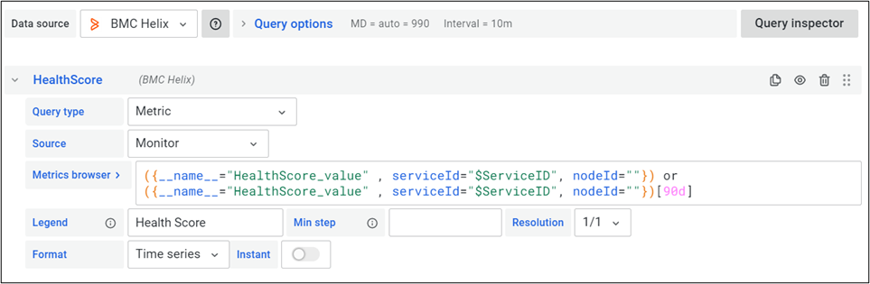
- Add another panel inside the row panel:
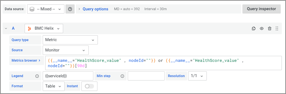
- Visualization type: Timeline
- Data source: BMC Helix
- Query type: Metric
- Query: ({__name__=”HealthScore_value” , serviceId=”$ServiceID”, nodeId=””}) or ({__name__=”HealthScore_value” , serviceId=”$ServiceID”, nodeId=””})[90d]
Refer to the screenshot below for more details:
- Apply the changes, resize the panels as per the dashboard view, and save the dashboard.
Now, the user can select multiple services from the dashboard filter, and the health score data for the selected services will be shown in a single view.
Next steps
This article highlights two BMC Helix Dashboards use cases that show data from multiple services in a single view, but they can be modified to create many similar dashboards.
BMC Helix Dashboards provides out-of-the-box dashboards for common use cases for different BMC Helix solutions. Service Dashboard is one such out-of-the-box dashboard that can be used to design more service dashboard use cases. Users can further customize these dashboards based on their unique requirements.
If you’d like to learn more about BMC Helix Dashboards and how to streamline service monitoring at your organization, I recommend checking out the Introduction to BMC Helix Dashboards webinar, followed by the BMC Helix Dashboards ITSM Best Practices webinar, for a good overview.