In this article, we’ll show you how to create reports with Microsoft BI.
The approach of Microsoft Power BI is a bit different than other products—it’s not always clear. The basic procedure is to repeat the steps below for each widget (graphical object) that you want on the report.
You can follow along in this article without doing the tutorial yourself. If you do want to work with it, we’ll use the same banking data from .csv files that we used previously, so review that to have some data to work with.
Let’s get started.
(This article is part of our Power BI Guide. Use the right-hand menu to navigate.)
How Power BI works: repeating pattern of steps
You can think of any report as a dashboard. A widget is some kind of visual display: a chart, a table, or just a single metric displayed in a text box.
The basic procedure is to repeat this process for each widget:
- Create a data source
- Run a transformation (Optional)
- Create a query or data model
- Pick a visualization
- Select fields
- Arrange visualization on dashboard
How to create Power BI reports
To illustrate, let’s move through each of these steps. First, we create a data source. That connects to a file, like a .csv, or a database.
Next, you have the option to run a transformation. In our example, we use financial data. We will:
- Apply a filter to select only negative values (payments)
- Drop and rename columns
- Optionally apply a function, such as an aggregation
Step 3 is the natural result of step 2, because you have built up a query in stages.
Alternatively, at this point, you could create a data model. For example, if you have sales and inventory movements in two data sources you can model that. You would create a model to show the common element between tables: product number. (But in the example we’re using, we only have a single data source.)
In step 4, you create a visualization. In this example, we will have a table of transactions. A table is a row and column display. We will also have a single card (like a text box) to show a single number, the maximum transaction amount.
Next, we’ll pick fields from step 4. Finally, in the last step, we’ll position the visualizations on the dashboard.
Now, let’s walk through an actual example.
A hands-on tutorial
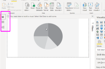
Here is the landing page for BI. By default, it shows a pie chart with no data. Notice the three icons on the left:
- Dashboard
- Queries
- Data model
Adding the first visualization
The logical place to start is to select a data source.
The basic procedure is to load and optionally select transform. In most cases, you would want to do a transformation.
For example, let’s click a column, then apply a filter to only have negative values (payments):
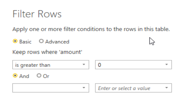
Here we select a numeric column, amount. Because it’s a number, we can run a math or aggregation function on it.
We select the Statistics function Maximum:
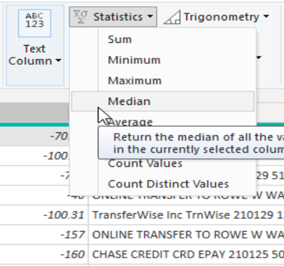
The result is a scalar (single value), as opposed to a row in a row-column table.
Now click on the new field and give it a meaningful name. Notice that BI keeps track of the steps we have taken.
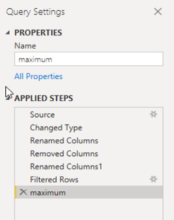
You’ll also want to rename the query. At this point, BI calls the results of the transformation a query.
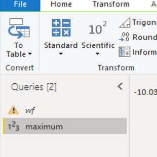
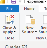
Click the close & apply button to close the Power BI editor and return to the dashboard view.
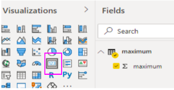
Select the card visualization, then select field maximum from the query maximum.
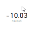
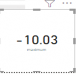
The card is added to the report:
Adding more visualizations
Now we can add another visualization to show how to build up your report.
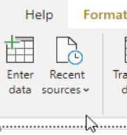
We will make a table. Select recent sources and pick the same .csv file. Importantly, we have to go all the way back to the beginning data source because we turned the first source into a query. (We can’t use the query to make a table, since it’s already transformed into a scalar.)
Now we have two queries:
- wf is a table
- maximum is the data source or the card visualization
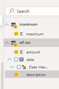
Here’s what the table looks like when attached to the dashboard:
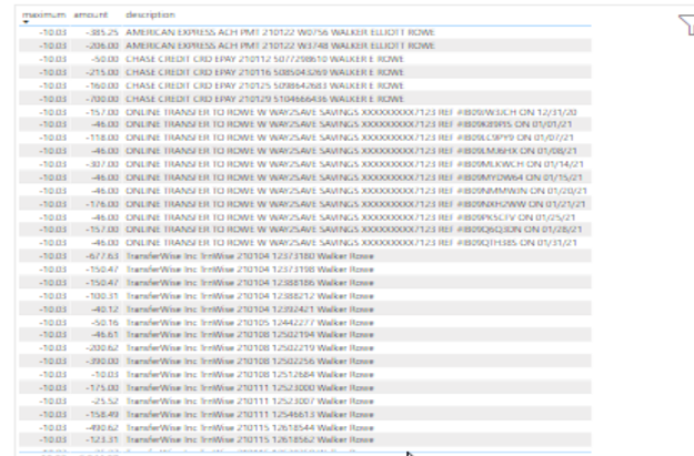
The text looks annoyingly small and graphic-like. It’s not like a spreadsheet, which would be clear and easy to read. (We will show how to clean that up in an upcoming tutorial.)
Finally, move the card over to make room for the table. Select the corner so you can resize it.
That concludes this tutorial. Now, you can begin building your reports with repeating the widget pattern.
Related reading
- BMC Machine Learning & Big Data Blog
- Power BI: Create Pie Chart with Power Query Editor
- Data Visualization Guide, a series of tutorials
- Data Storage Explained: Data Lake vs Warehouse vs Database
- Enabling the Citizen Data Scientists
- MySQL vs MongoDB: Comparing Databases
These postings are my own and do not necessarily represent BMC's position, strategies, or opinion.
See an error or have a suggestion? Please let us know by emailing [email protected].


